Client: Branding & Web Design Languages: German & English, both sites in full
Two brands, one system — a logo and two bilingual websites for the Wächter Group
Two sister brands, two websites, one design system — fully bilingual throughout
The Wächter Group runs two businesses under one roof: Wächtergroup for security services (property protection, reception services, event security, construction-site security) and WG Dienstleistungen for cleaning and property maintenance (office cleaning, stairwell cleaning, building upkeep). Both operate from Vienna across Austria, both approach the same buyers — property managers, developers, event organisers, businesses — and both needed a presence of their own without the group behind them falling apart into two unrelated companies. On top of that, enquiries had to stop landing in the wrong place: someone looking for cleaning who starts on the security site must not be lost.
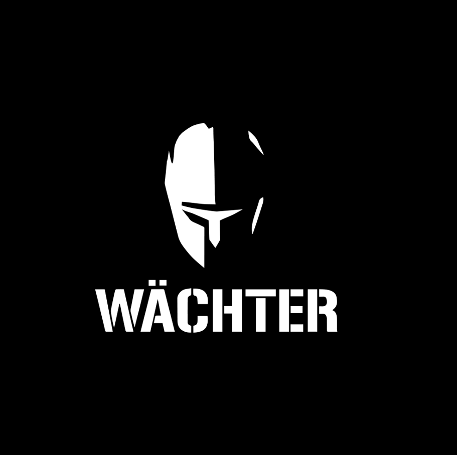
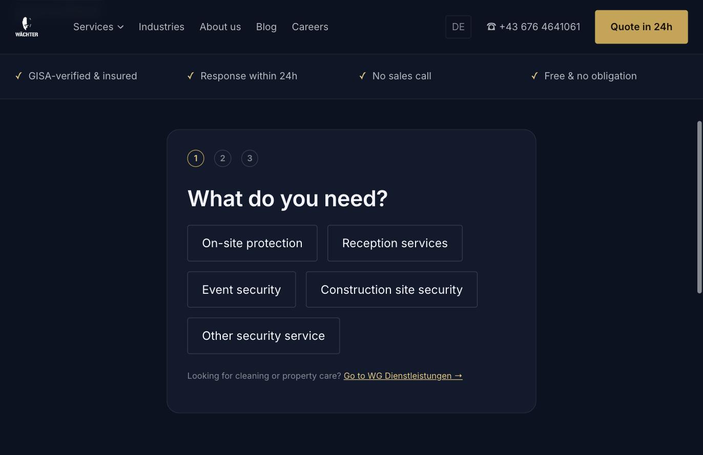
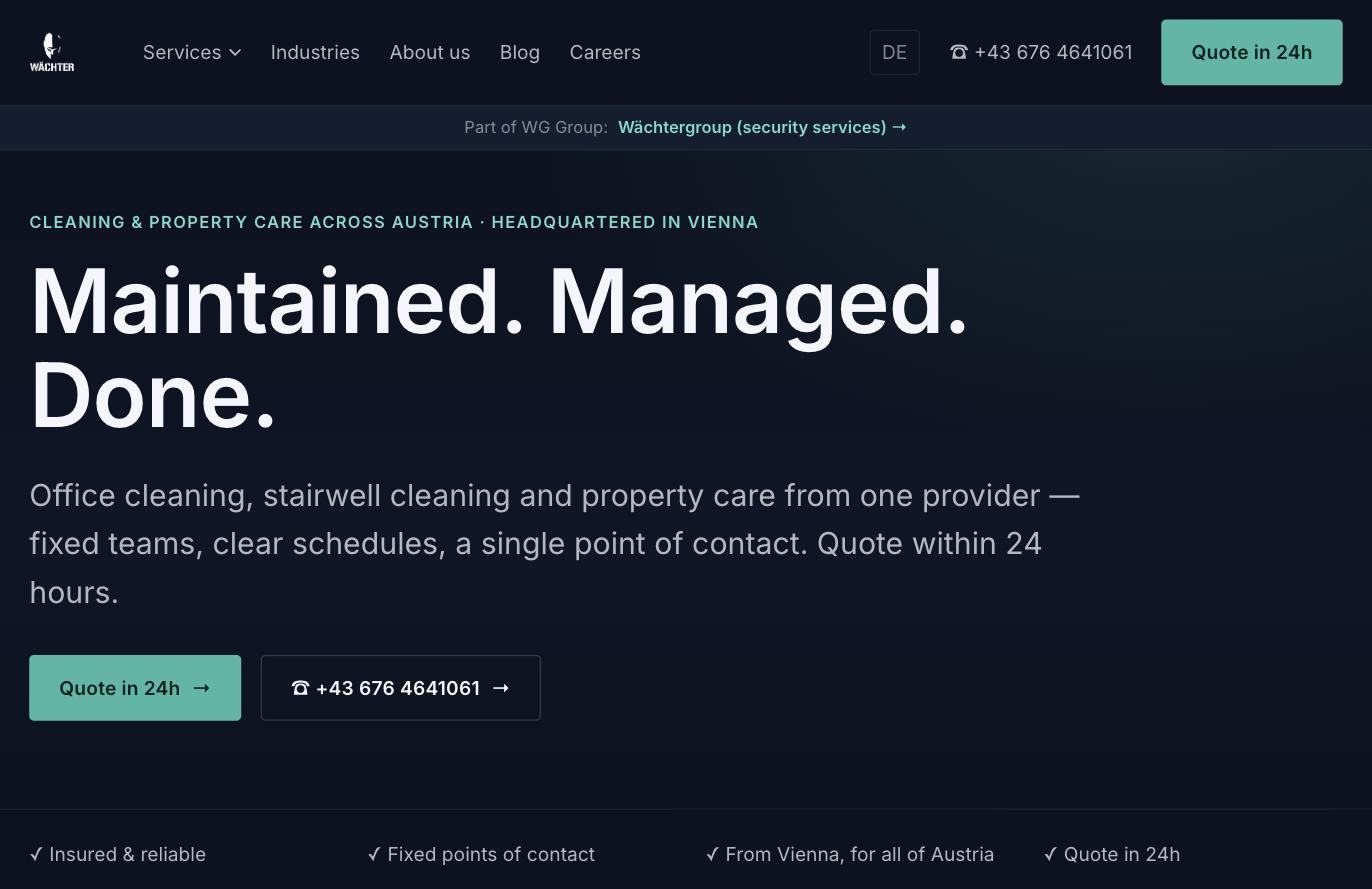
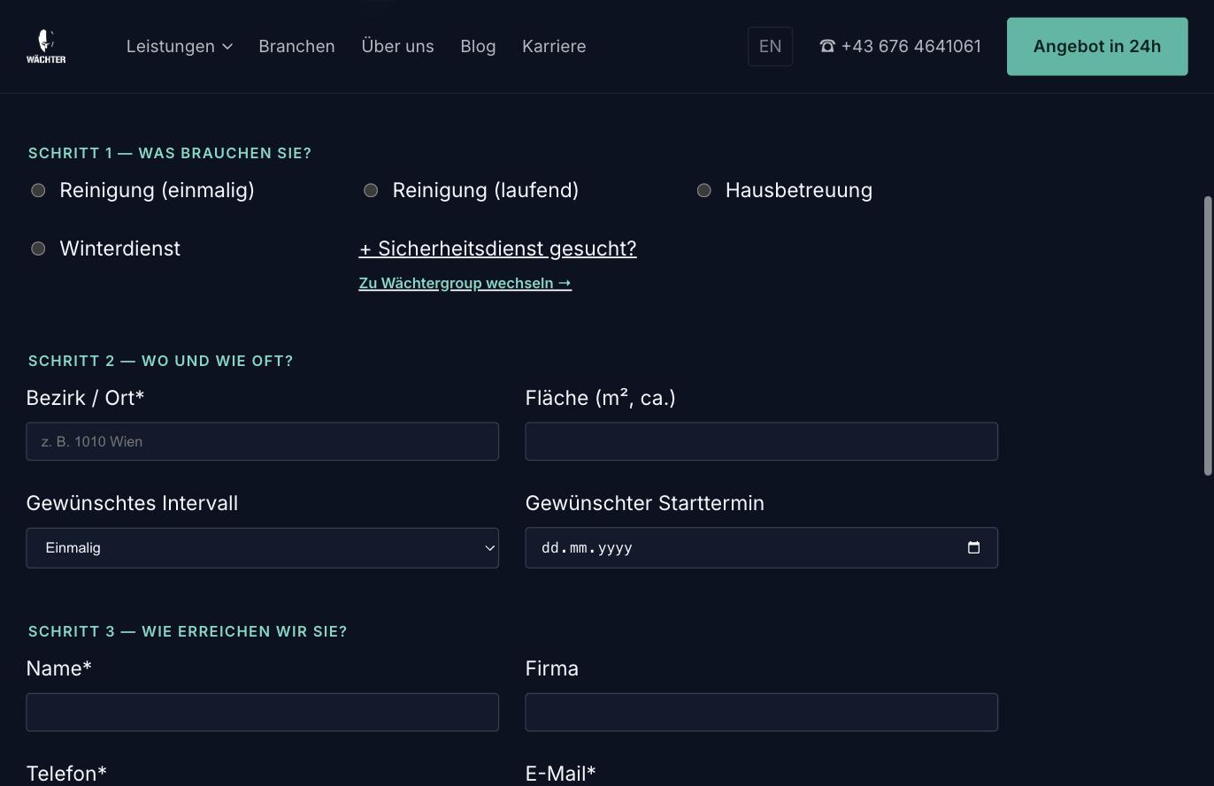
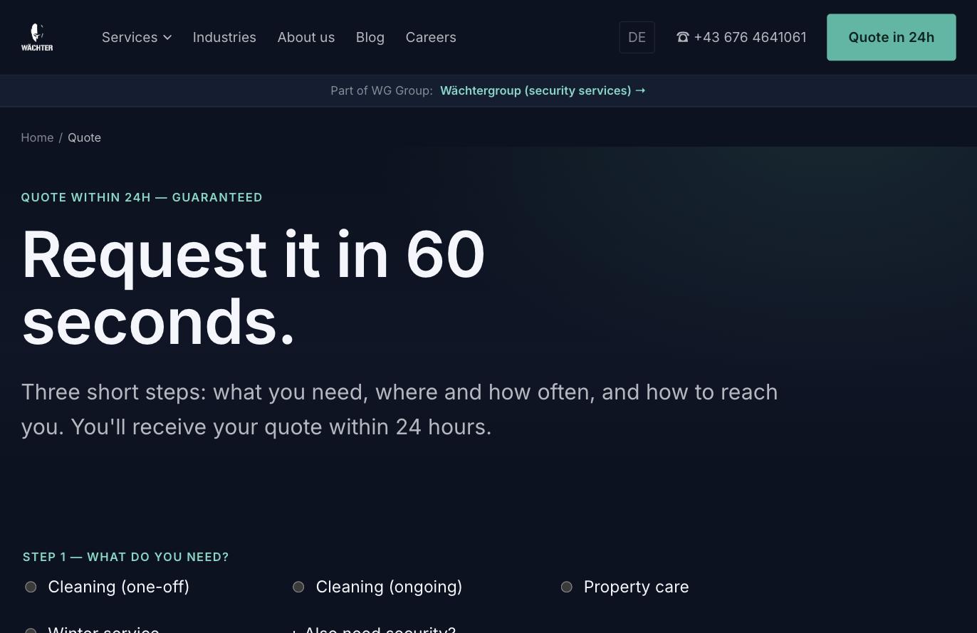
M73LAB developed a logo for the group — the guardian helmet mark above a stencil wordmark — and built two standalone websites on top of it, waechtergroup.at and wg-dienstleistungen.at, sharing a single design system. Both sites use the same architecture, navigation and components; they are told apart by accent colour alone: gold for security, green for cleaning and property maintenance. Both are fully bilingual in German and English. At the centre of each site is a three-step quote wizard that sorts an enquiry by service, property and contact — and that routes visitors who landed in the wrong business straight to the sister site instead of letting them bounce. A band at the top of every page keeps the group relationship permanently visible. Each brand also got a blog built around local and regulatory topics — when Vienna events legally require an awareness concept, how property protection differs from works security — so the sites earn visibility on the questions their buyers actually search.
Two businesses, one sender: decided what appears together and what belongs apart.
Helmet mark and stencil wordmark for the Wächter Group, in light and dark variants.
One component and layout base for both brands, told apart by accent colour alone.
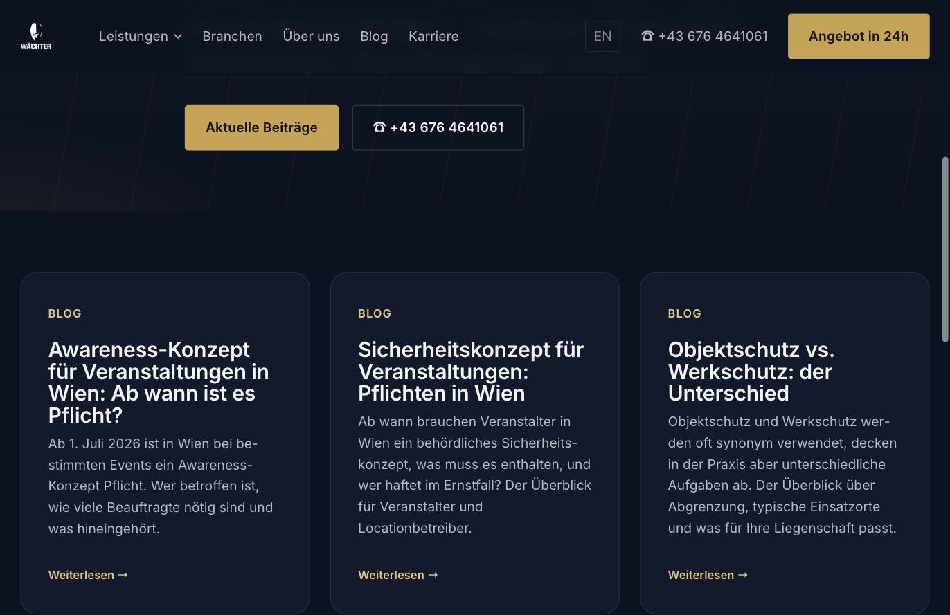
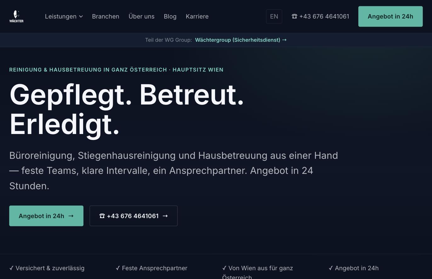
waechtergroup.at and wg-dienstleistungen.at, each in full German and English.
A three-step quote wizard per site, routing to the sister brand instead of dead-ending.
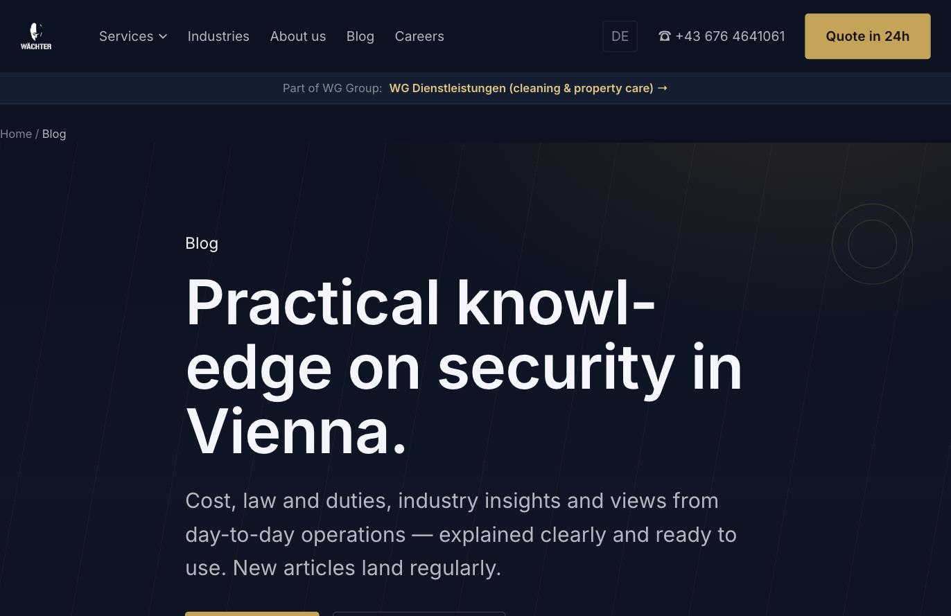
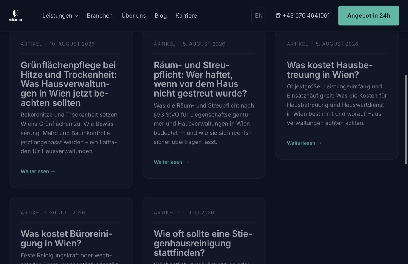
A blog per brand on local and regulatory topics, aimed at Vienna search.
Logo developed for the Wächter Group — helmet mark and stencil wordmark, in light and dark variants
Two standalone websites: waechtergroup.at (security services) and wg-dienstleistungen.at (cleaning & property maintenance)
One shared design system across both brands, differentiated only by accent colour
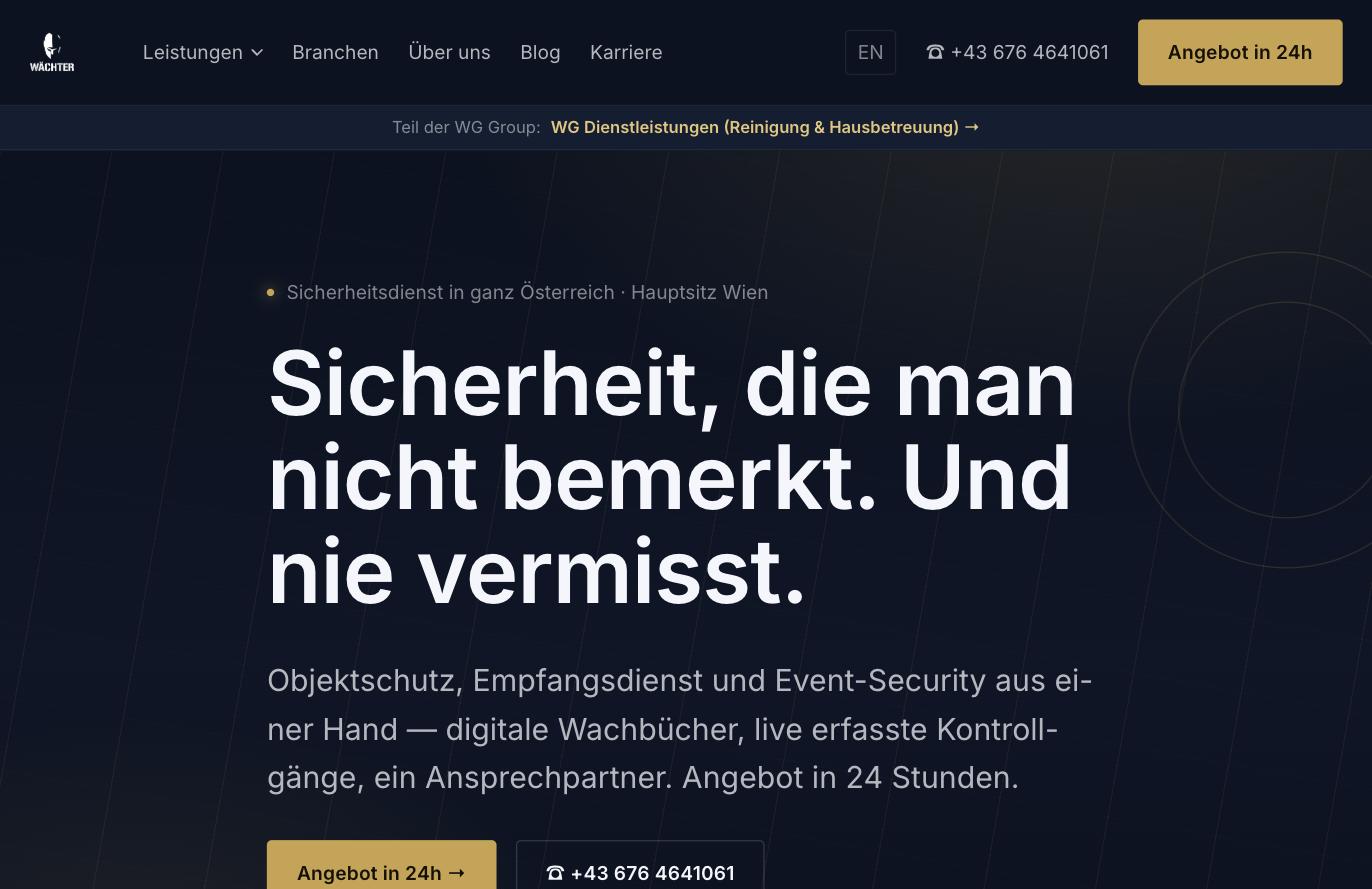
Both sites fully bilingual: German and English
Three-step quote wizard on each site, routing to the sister brand when the enquiry belongs there
Reciprocal linking between the two brands via a permanent band in the page header
A blog per brand covering local and regulatory topics, for visibility in Vienna search
Trust markers placed directly at the form: GISA-certified & insured, reply within 24h, no sales pitch, free and non-binding
A helmet mark above a stencil wordmark — close enough to the security trade to be understood instantly, without tipping into something martial. Drawn in light and dark variants, because the mark has to hold on dark websites just as well as on vehicles, ID cards and paperwork.
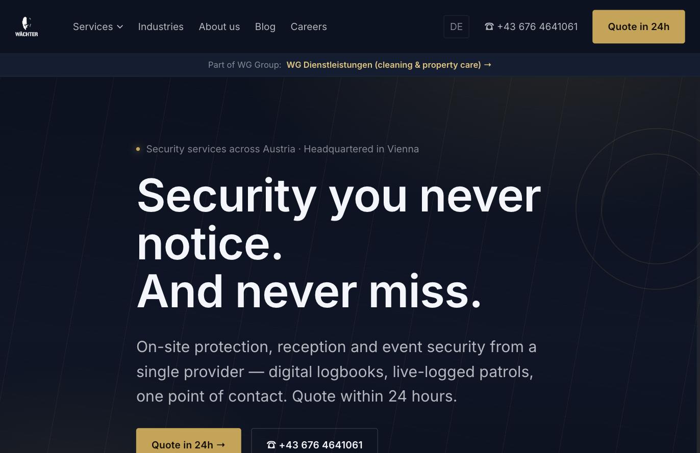
The presence for property protection, reception services, event security and construction-site security. Gold as the accent, and a quote within 24 hours as a promise repeated in the header, the hero and the foot of every page.
 Routed, not bounced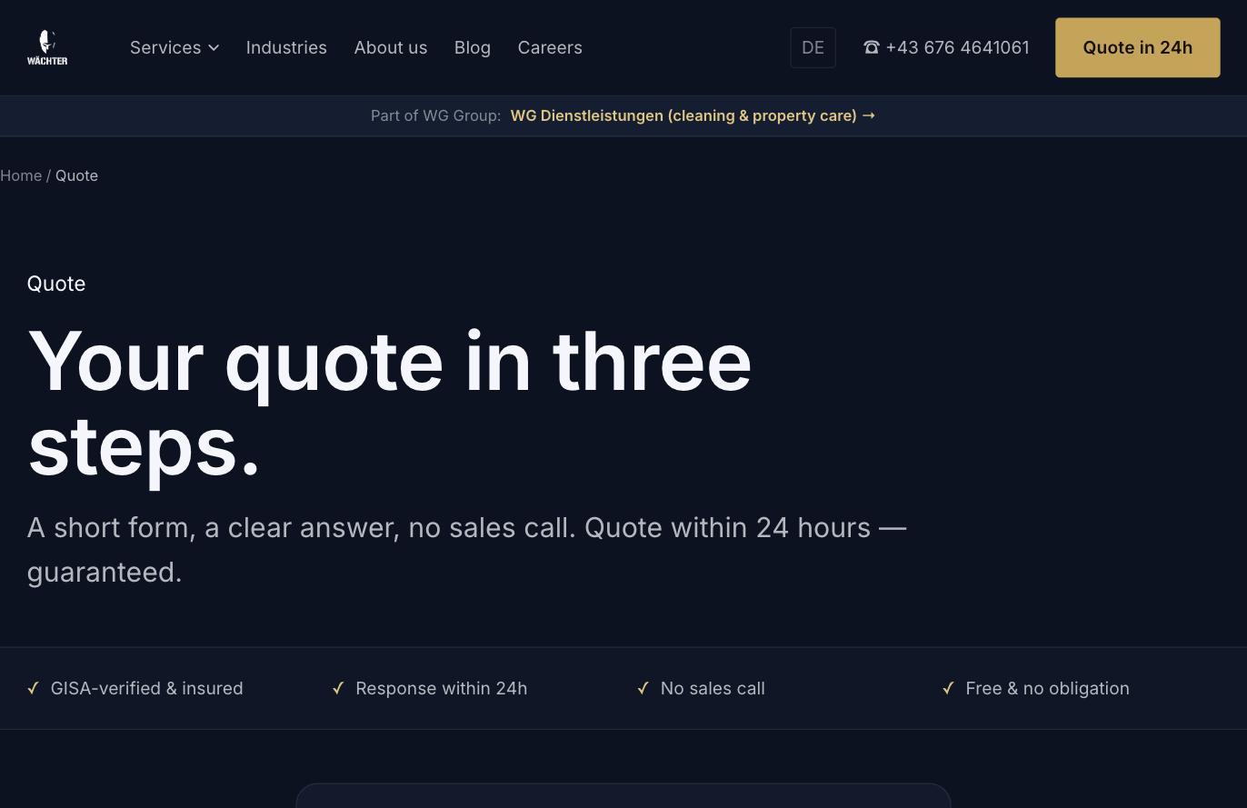
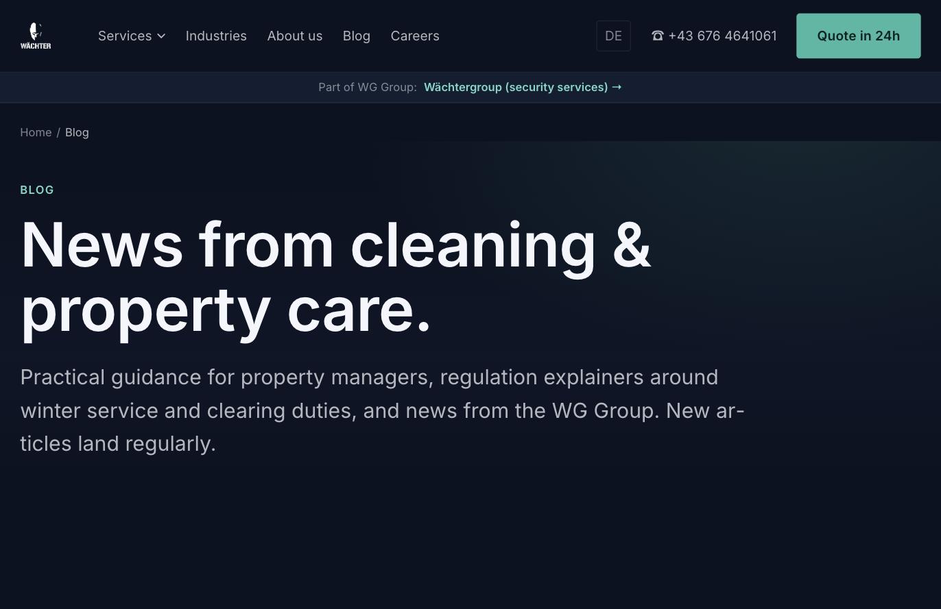
The same architecture, a different accent: green instead of gold. Office cleaning, stairwell cleaning and building upkeep, carrying the same trust markers and the same quote flow — so the group reads as one organisation rather than two loosely related firms.
Free website & SEO audit in your inbox within 48h — or book a call directly.