Client: Branding & Web Design Languages: German & English
Brand, logos and website for 7AGRA — clipping agency and music pushing
A complete brand and website for a clipping agency — and an ongoing engagement
7AGRA cuts artists' content into clips and pushes music to real audiences — performance-based, not reach without effect. The business needs explaining: clipping and music pushing are new terms to many artists and labels, and the market is crowded with providers promising the same thing and delivering views worth nothing. So the brand had to do two jobs at once — sound credible inside the scene, and be understandable within seconds to a client hearing the term for the first time. On top of that, the attitude the brand had to carry: 7AGRA takes on an industry that has fed artists reach promises for years. That had to be visible in the brand — without anyone having to explain it.
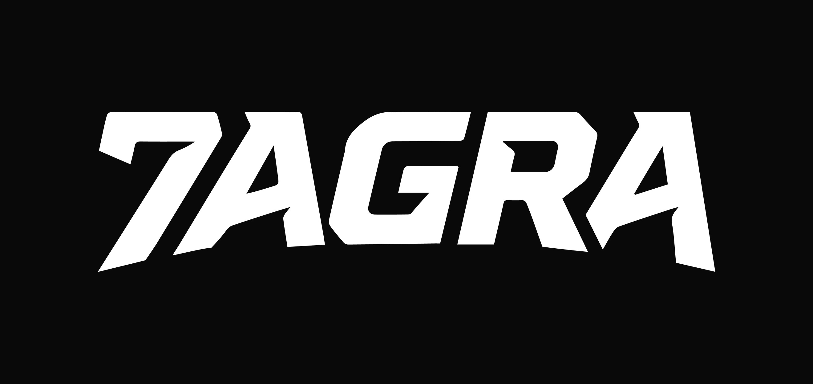
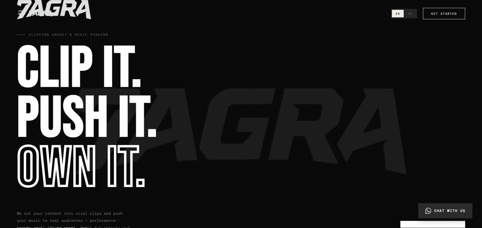
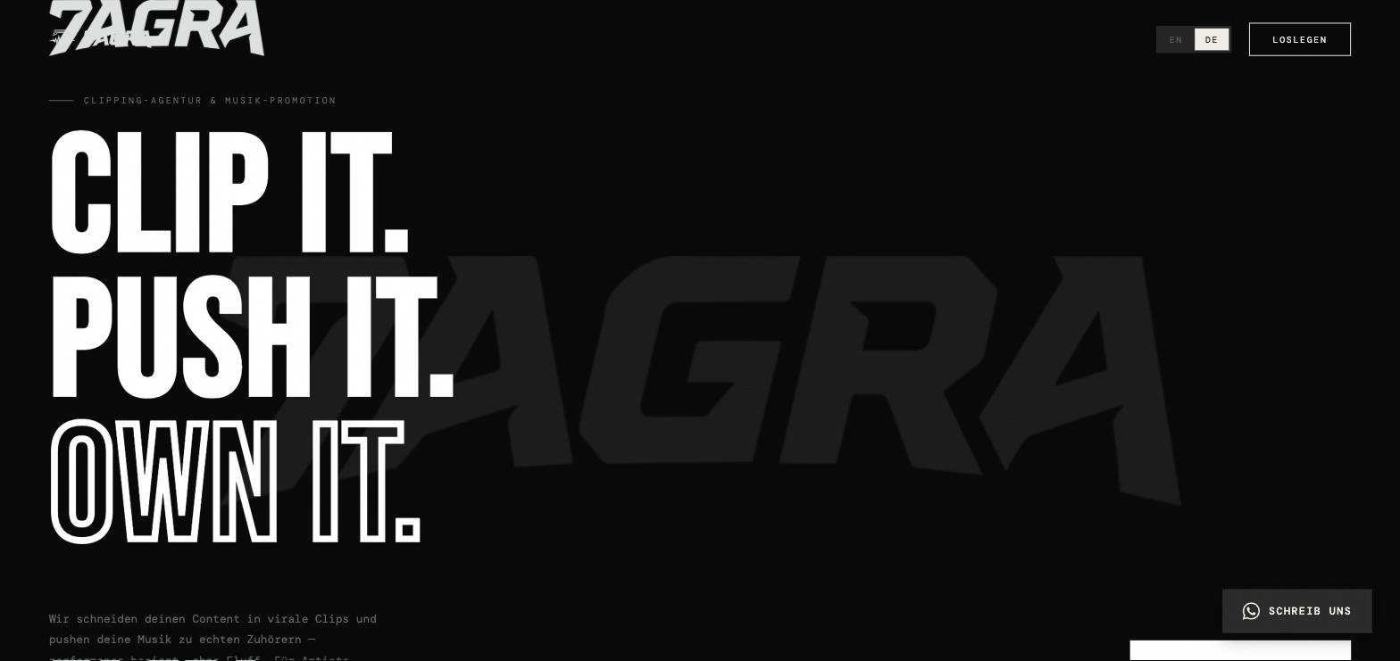
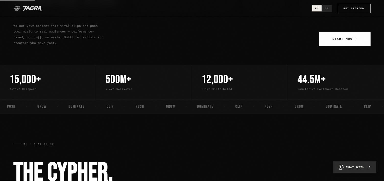
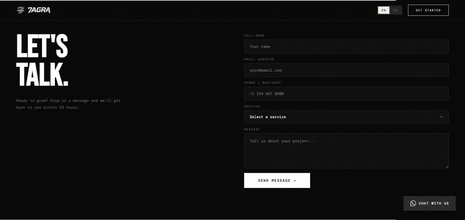
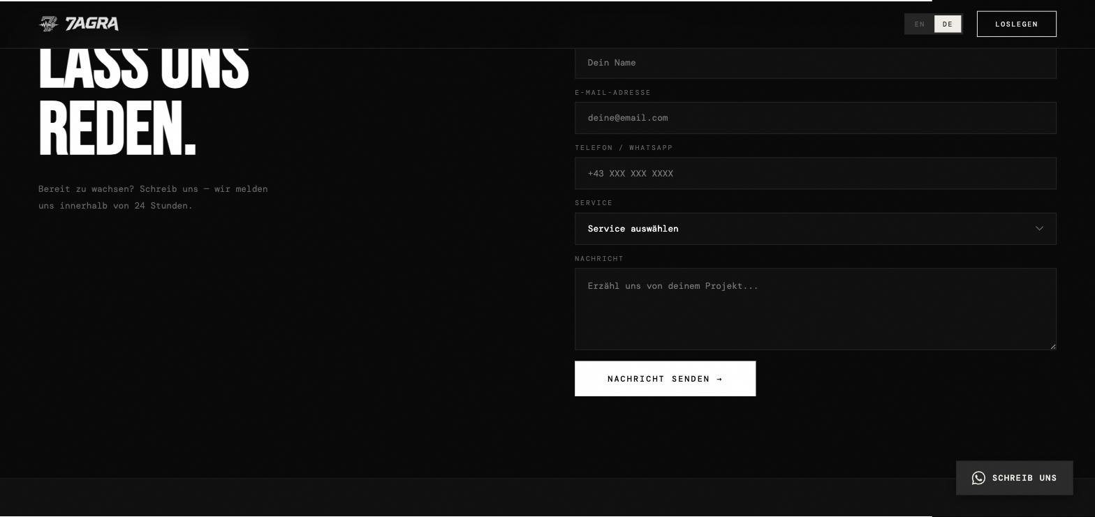
M73LAB built the brand from the ground up: two logos — a wordmark whose cut, forward-leaning letters carry the cutting motion the business is named for, and an icon that ties the 7 of the name to a music element, so the name and what the company does land in a single mark. On top of that, deliberately monochrome branding: black on black with white type as the only contrast — in a category where nearly every competitor shouts in neon and numbers, restraint is the louder signal. The website carries the positioning in three words: Clip It. Push It. Own It. Below it, dedicated sections cover the offer, the service levels, the process and the common questions — in the order an artist actually comes to understand the thing. The site is fully bilingual in German and English, and contact runs straight through WhatsApp rather than a form nobody fills in. 7AGRA is still a client; the brand keeps being developed.
The brand takes the industry on rather than standing politely beside it. That posture became the starting point for the marks, the tone and the site.
A wordmark in cut, leaning letterforms; an icon tying the 7 to a music element.
Monochrome, black with white type — the opposite of the neon look the category defaults to.
The offer reduced to three words: Clip It. Push It. Own It.
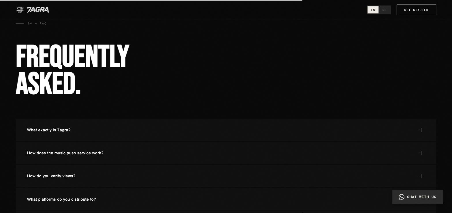
Offer, service levels, process and FAQ, in full German and English.
7AGRA remains a client; the brand keeps being built out.
Two logos developed: a wordmark and an icon tying the 7 of the name to a music element
Brand kept deliberately monochrome — black, with white type as the only contrast
Positioning reduced to three words: Clip It. Push It. Own It.
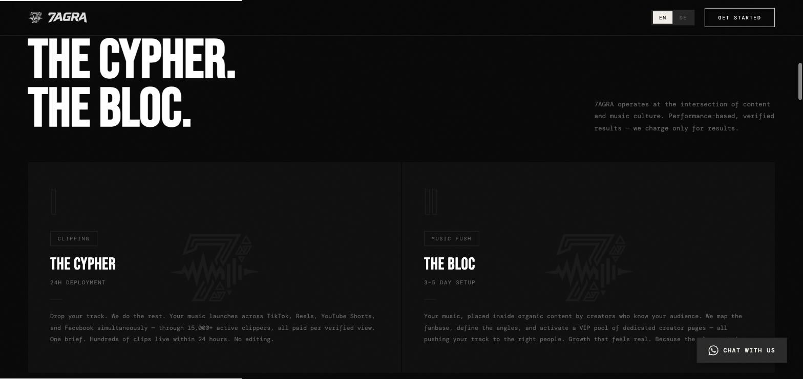
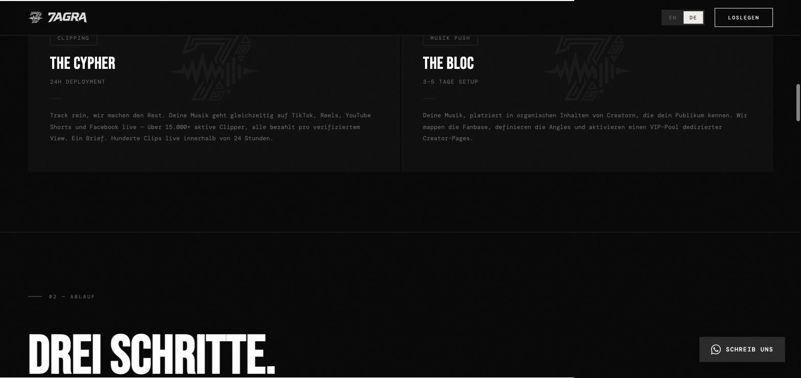
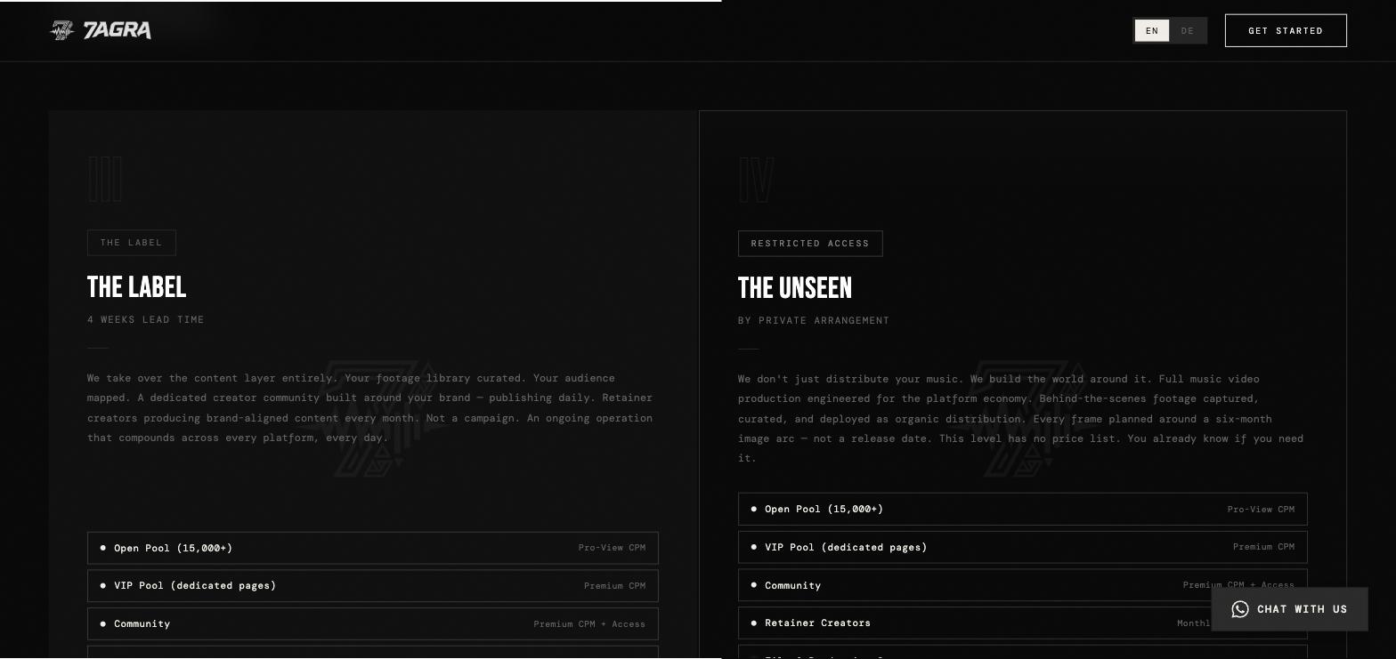
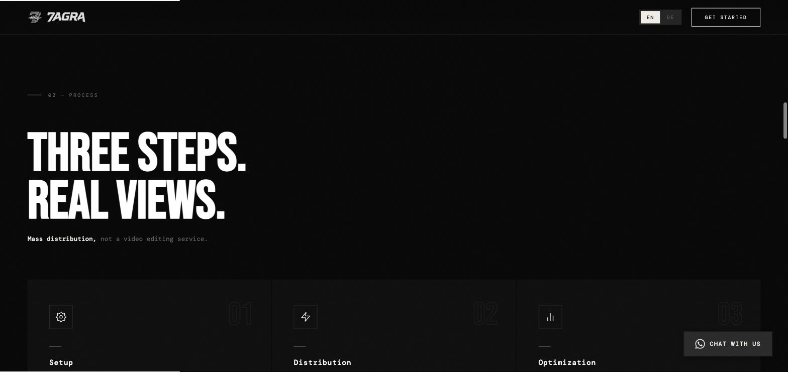
Website with dedicated sections for the offer, service levels, process and FAQ
Fully bilingual: German and English
Direct contact through WhatsApp instead of a conventional contact form
Ongoing engagement — 7AGRA is still a client
Two marks for two situations: the wordmark where there is room, the icon where there isn't — the profile picture, the favicon, the clip itself. The leaning, cut letterforms carry the cutting motion the business is built on; the icon ties the 7 of the name to a music element, so the name and the service land in one mark.

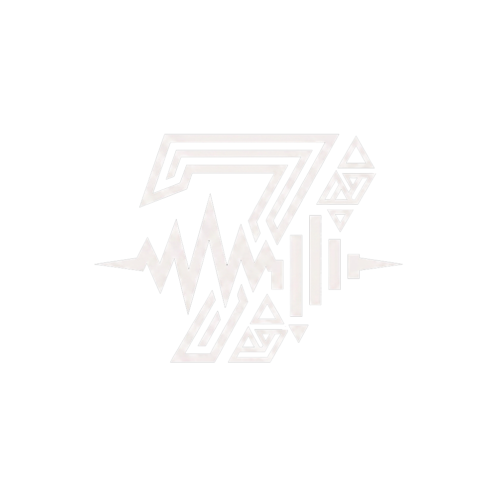 Name meets music
 Clip It. Push It. Own It. — the positioning sits above everything else. Below it, dedicated sections walk through the offer, the service levels, the process and the FAQ, in the order an artist actually comes to understand the thing. Kept monochrome: in a category full of neon and promised numbers, restraint is the louder signal.
Free website & SEO audit in your inbox within 48h — or book a call directly.