Client: Branding & Web Design Location: Dubai, UAE — booking worldwide
Two logos and the website for RYU MUSIC — artist management, booking and production out of Dubai
Two logos and a website serving artists, promoters and production clients at once — engagement ongoing
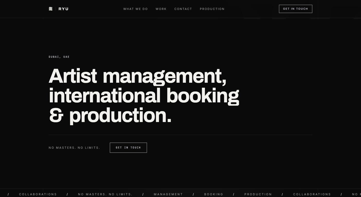
RYU MUSIC works in three directions at once out of Dubai: artist management, international booking and production. That isn't a service list, it's three businesses with three different counterparts — artists looking for a career partner; clubs and promoters worldwide who want a booking handled; and clients commissioning a video production. Building a site that takes all three seriously without reading like a jack-of-all-trades is the actual brief. On top of that sits the brand's own position: RYU carries itself with confidence — 'No masters. No limits.' — and a presence that claims that while looking cheap undermines the claim on sight.
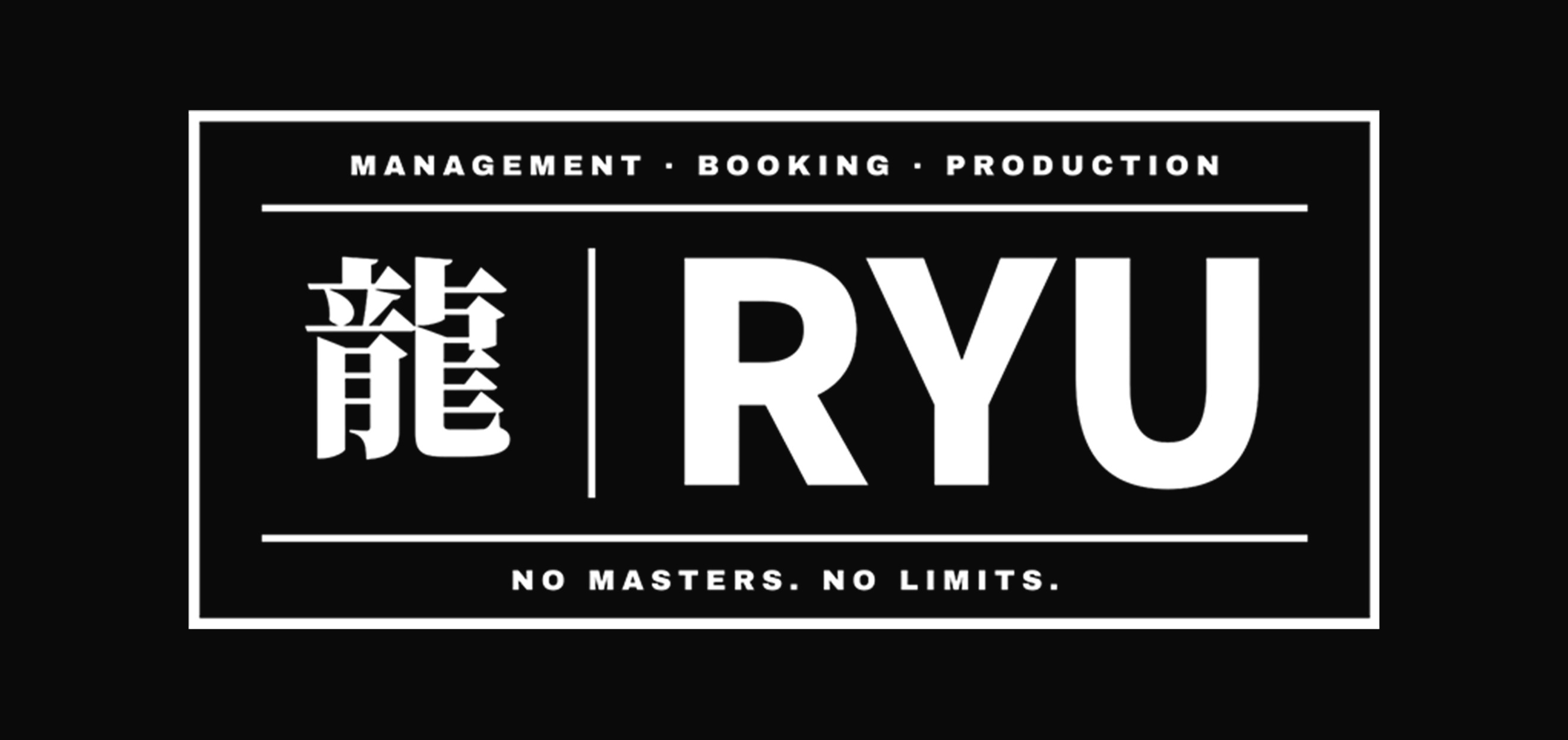
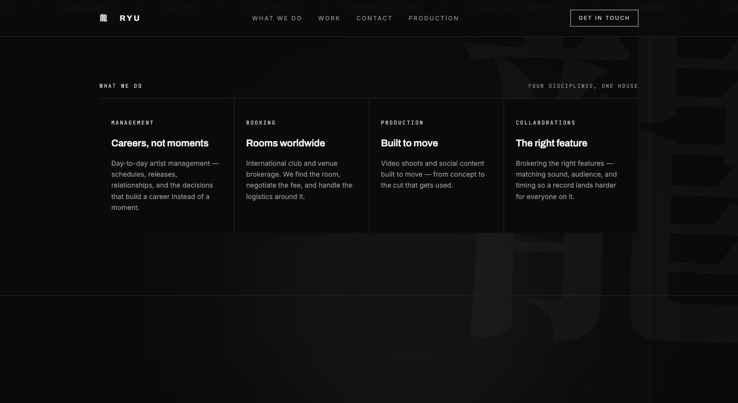
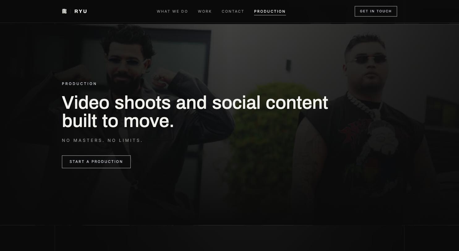
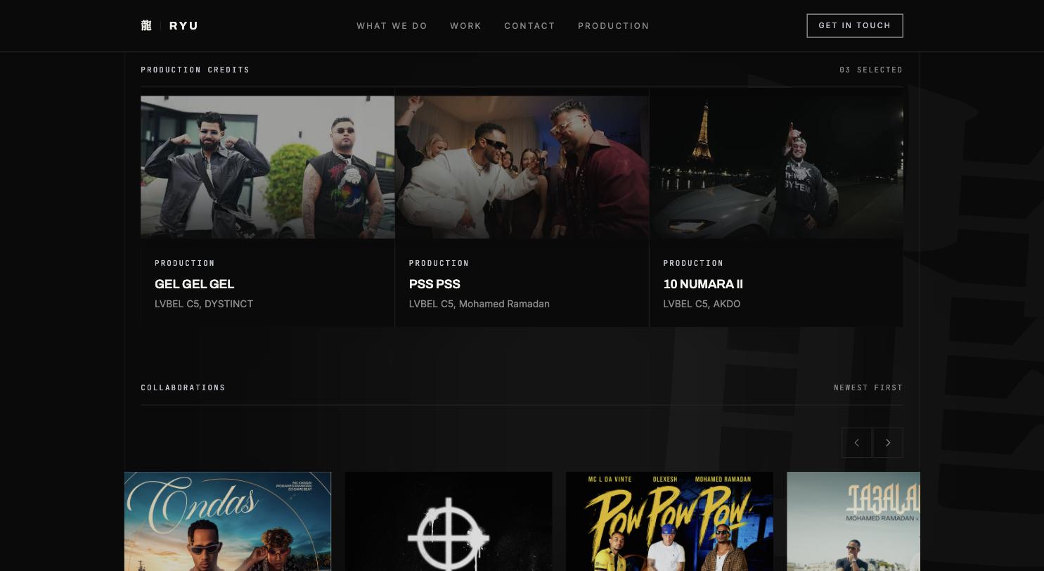
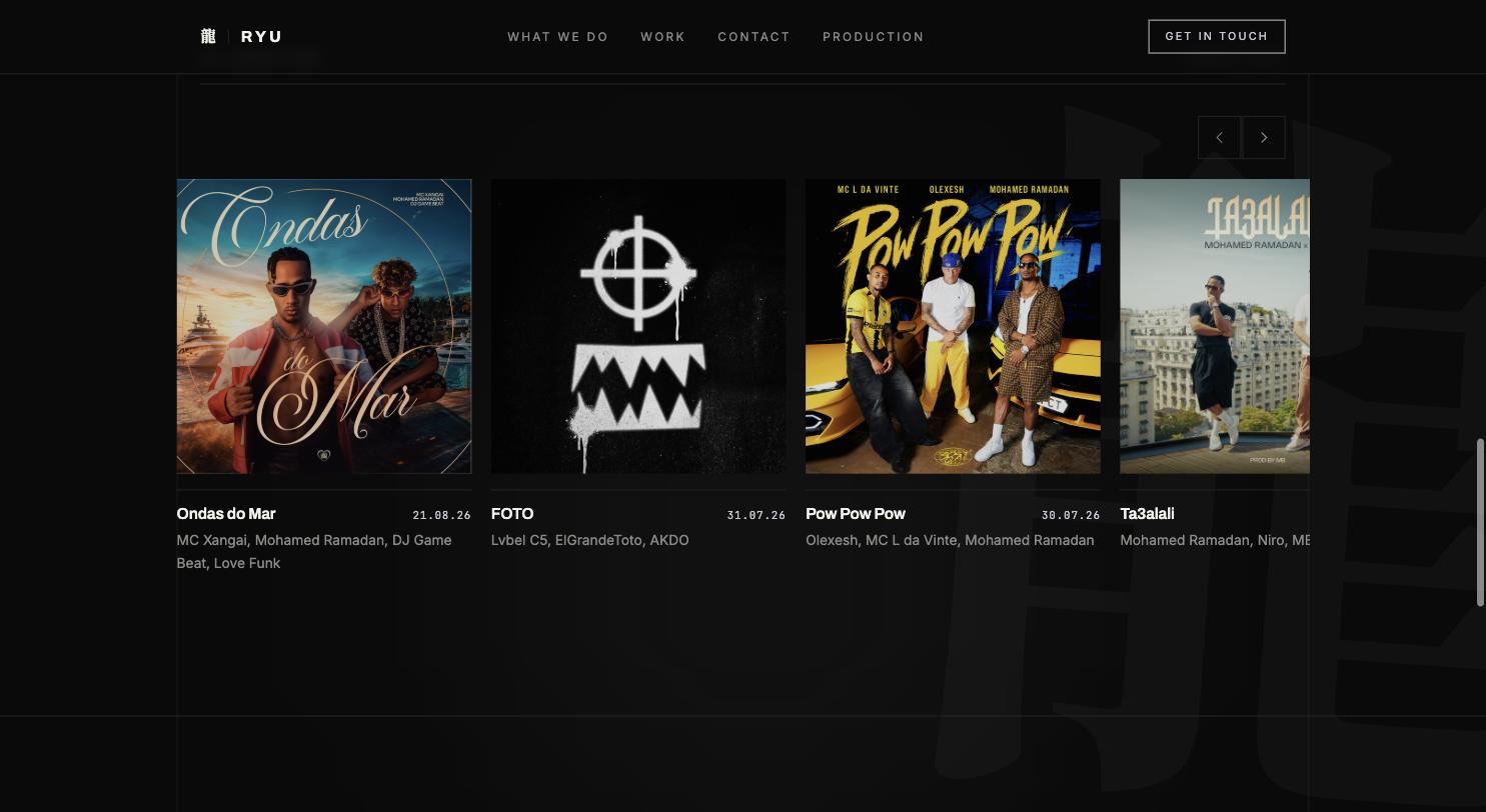
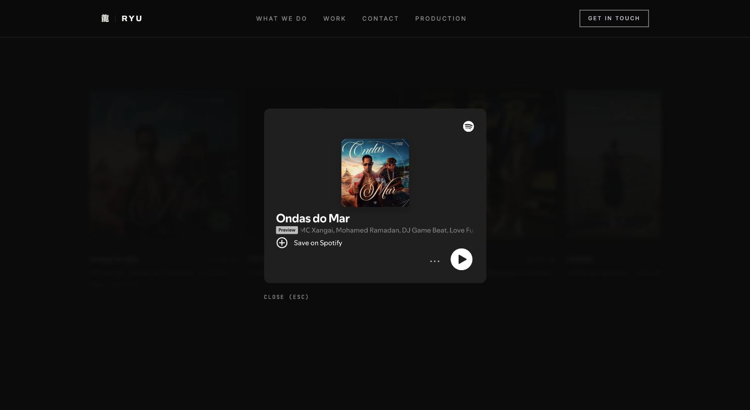
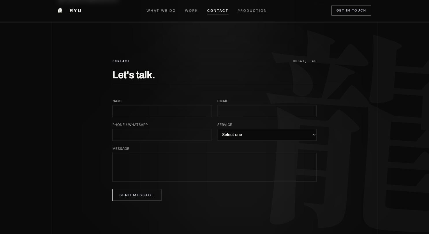
M73LAB developed the brand and the website. Two logos: a wordmark for anywhere there is room, and an icon for anywhere there isn't — profile pictures, social, documents. The presence is deliberately dark and stripped back, because this brand carries its position through posture rather than colour. The website separates the three businesses into clearly distinct areas: 'What we do' gives management, booking, production and collaborations a promise each — 'Careers, not moments' for management, 'Rooms worldwide' for booking, 'Built to move' for production. Production gets a page of its own covering two routes, the standard and the deliverables, so an enquirer knows what they are getting before they ask. Collaborations run as a grid of tiles that open, rather than a wall of text. Contact is a form that sorts the enquiry before it arrives. RYU MUSIC is still a client; the site is maintained and extended on an ongoing basis.
Management, booking and production address different counterparts — the structure had to show that rather than blur it.
A wordmark for the large surfaces, an icon for profile pictures, social and documents.
Dark and stripped back — the brand's position is carried by posture, not colour.
A distinct area per business, a dedicated production page, collaborations as a tile grid.
A contact form that classifies the enquiry before it reaches an inbox.
RYU MUSIC is still a client; the site keeps being developed.
Two logos developed: a wordmark and an icon, each in light and dark variants
Dark, stripped-back brand presence — position carried through posture rather than colour
Website that keeps management, booking, production and collaborations clearly separate
Dedicated production page covering two routes, the standard and the deliverables
Collaborations as an expandable tile grid rather than a wall of text
Contact form that sorts the enquiry up front
Ongoing engagement — RYU MUSIC is still a client
Two marks for two situations: the wordmark where there is room, the icon where there isn't — profile picture, social, documents. Both drawn in light and dark variants, because this mark lands on a contract as often as on a black screen.

 Short form
 Three businesses, kept apart: management, booking and production each get their own promise rather than sharing one service list. Kept dark, because the brand carries its position through posture — 'No masters. No limits.' is on the page in those words.
Free website & SEO audit in your inbox within 48h — or book a call directly.